Style guide
Every specimen below is rendered from the live design tokens, so this page cannot drift from the system. Each one is labelled with the exact token or variant name to type when reusing it.
Colour
Swatches read their value straight from the CSS variable, in whichever theme is active. Use the semantic name, never the raw value — that is what makes light and dark work for free.
Surface
The layers a page is built from. Pick the flattest one that still separates content — page, then card, then a raised popover.
--backgroundbg-backgroundThe page itself. Every screen starts here.
--cardbg-cardPanels sitting on the page: cards, speaker tiles, schedule rows.
--popoverbg-popoverFloating layers above the page: menus, tooltips, dialogs.
--mutedbg-mutedQuiet bands and fills that separate a section without a border.
--secondarybg-secondaryNeutral chips and secondary fills that must not read as brand.
--surface-glassbg-surface-glassThe frosted sticky header and glass cards.
--dark-sectionbg-dark-sectionFull-bleed alternate bands that stay dark in both themes: CTA, sponsors, footer.
Content
Text and icons. Each surface has a matching foreground — never pair a foreground with a surface it was not made for.
--foregroundtext-foregroundDefault body and heading text on the page.
--card-foregroundtext-card-foregroundText inside cards and panels.
--popover-foregroundtext-popover-foregroundText inside floating layers.
--muted-foregroundtext-muted-foregroundSupporting text: captions, labels, metadata, placeholders.
--primary-foregroundtext-primary-foregroundText and icons on a primary or gradient fill.
--accent-foregroundtext-accent-foregroundText and icons on the pink accent fill.
--accent-on-darkbg-accent-on-darkHeadings and emphasized text on a dark-section band. Never on light backgrounds.
Interactive
Anything a person can act on. The pink-to-blue gradient is the brand's primary action; the flat primary is its calm sibling for dense UI.
--primarybg-primaryThe main action, active nav state and key numbers.
--primary-hoverbg-primary-hoverHover and pressed state of a primary control.
--primary-subtlebg-primary-subtleTinted background behind a brand badge or selected row.
--accentbg-accentThe pink half of the brand. Highlights, never a second button style.
--accent-subtlebg-accent-subtleTinted background for accent chips.
--borderbg-borderDividers and the outline of outline buttons and cards.
--inputbg-inputField borders in their resting state.
--ringbg-ringThe focus ring on every keyboard-focusable control.
Feedback
Status only — never decoration. Each has a solid fill for badges and a subtle tint for message backgrounds.
--successbg-successConfirmed, free, available, registration complete.
--success-subtlebg-success-subtleBackground of a success message.
--warningbg-warningFew seats left, deadline approaching, needs attention.
--warning-subtlebg-warning-subtleBackground of a warning message.
--destructivebg-destructiveErrors, sold out, cancel and delete actions.
--destructive-subtlebg-destructive-subtleBackground of an error message or invalid field.
--infobg-infoNeutral information: venue notes, track labels.
--info-subtlebg-info-subtleBackground of an informational note.
Gradient
The pink-to-purple gradient is the brand's primary. It belongs on the one leading action of a screen and on hero headlines — nowhere else.
bg-gradient-primarytext-gradient-primaryTypography
Geist for everything, Geist Mono for anything technical: times, ticket codes, token names. Sizes come from named steps, never from ad-hoc classes.
One day of building in the open
text-display— · — weight · — line-heightThe single hero headline of a page. Never twice on one screen.
Talks, workshops and a lot of coffee
text-h1— · — weight · — line-heightPage titles below the hero.
Meet this year's speakers
text-h2— · — weight · — line-heightSection headings.
Designing with tokens, not pixels
text-h3— · — weight · — line-heightCard and list-item titles.
Doors open at nine in Zurich. Bring a laptop, a project you care about, and expect to leave with something that runs.
text-body— · — weight · — line-heightParagraphs and default reading text.
Tickets are free, but seats are limited to six hundred.
text-small— · — weight · — line-heightSupporting text, helper copy and dense lists.
Main stage · 10:00
text-caption— · — weight · — line-heightLabels, chips, metadata and eyebrows.
font-sansfont-monoSpacing
The standard 4px scale — no parallel system. Gaps inside a component step by 2 and 3; gaps between blocks step by 6, 8 and 12.
p-1 / gap-14pxp-2 / gap-28pxp-3 / gap-312pxp-4 / gap-416pxp-6 / gap-624pxp-8 / gap-832pxp-12 / gap-1248pxp-16 / gap-1664pxRadius & elevation
Every radius derives from one token, so changing --radius rescales the whole system. Elevation is one ladder of four steps plus a brand accent — every shadow in the system is one of these variables, never a hand-written box-shadow.
rounded-fieldrounded-cardrounded-lgrounded-pillshadow-flat--shadow-flatFlush with the page. Separation comes from border-border alone: outline cards, table rows, section blocks.
—shadow-raised--shadow-raisedResting lift: raised cards, the gradient button, sticky headers, feature medallions.
—shadow-lifted--shadow-liftedSomething is being acted on: hover or drag of a level-1 surface, elevated cards.
—shadow-overlay--shadow-overlayFloats above the page and closes: popovers, dropdowns, dialogs, toasts.
—shadow-glow--shadow-glowNot a depth step. Brand emphasis behind gradient surfaces such as the hero CTA panel.
—surface-glasshover-liftMotion
Motion confirms an action — a press, a toggle, an expand. Nothing fades in on load, and nothing moves that the person did not touch. Hover each bar to see its timing.
--duration-fast—Colour changes on buttons and links
--duration-base—Lifts, expands, toggles
--duration-slow—Large surfaces entering
--ease-standard—Default easing for state changes
--ease-emphasized—Motion that should feel confident
Icons
Lucide is the base icon set, plus curated brand/social glyphs, always rendered through the Icon component so size and colour stay on-system.
Code
<Icon name="ticket" size="md" tone="brand" />
Components
Every variant and every state that applies, side by side. States that a component does not own are marked so — they are handled by the field or the surrounding form.
Tabs
Teach something amazing at Vibe Code Fest.
bg-muteddata-[state=active]:bg-backgroundshadow-raisedring-ringTalk proposals are open.
disabled:opacity-50Code
<Tabs defaultValue="talk">
  <TabsList aria-label="Ways to contribute">
    <TabsTrigger value="talk">Talk/Session</TabsTrigger>
    <TabsTrigger value="volunteer">Volunteer</TabsTrigger>
  </TabsList>
  <TabsContent value="talk">Talk content</TabsContent>
  <TabsContent value="volunteer">Volunteer content</TabsContent>
</Tabs>
Button
variant="gradient"variant="solid"variant="secondary"variant="ghost"variant="link"variant="destructive"variant="muted" · gradient backgrounds onlyHover and focus are live — point at or tab to any button above. The focus column shows the ring statically so both can be compared.
Which variant where: inside cards use gradient, solid or secondary. Inside a call-to-action panel use secondary. ghost and link stay for tertiary and inline actions only.
Code
<Button variant="gradient" size="lg" loading={isSaving}>
  Get tickets
</Button>
In context
Registration form
Feature card & CTA panel
Feature card
Icon medallion, heading and short supporting text — for non-interactive content.
Clickable feature card
Pass href and the whole card becomes a link, with hover lift and a focus ring.

Feature card with picture
Pass imageSrc and a circular photo replaces the icon medallion.
Code
<FeatureCard
  icon="sparkles"
  title="Feature card"
  description="Short supporting text."
/>

<FeatureCard
  href="/programme"
  icon="ticket"
  title="Clickable feature card"
  description="Whole card is a link."
/>

<FeatureCard
  imageSrc={speakerPhoto}
  imageAlt="Speaker"
  title="Feature card with picture"
  description="Circular photo instead of the icon medallion."
/>

<CtaPanel
  title="Call-to-action panel"
  description="Full-bleed gradient panel."
  actionLabel="Get your ticket"
  actionHref="/tickets"
  image={{ src: speakerPhoto, alt: "Speaker" }}
/>
Input
Code
<Input
  label="Email"
  error={errors.email}
  hint="We only email you the ticket."
/>
Badge
variant="neutral"WorkshopWorkshopvariant="brand"WorkshopWorkshopvariant="info"WorkshopWorkshopvariant="success"WorkshopWorkshopvariant="warning"WorkshopWorkshopvariant="destructive"WorkshopWorkshopBadges are static labels: no hover, focus, disabled or loading state.
Code
<Badge variant="success" tone="solid">Free</Badge>
Card
Workshop pass
Twelve seats, hands on
Build a small app end to end with a mentor at your table.
variant="plain"Workshop pass
Twelve seats, hands on
Build a small app end to end with a mentor at your table.
variant="outline"Workshop pass
Twelve seats, hands on
Build a small app end to end with a mentor at your table.
variant="elevated"Workshop pass
Twelve seats, hands on
Build a small app end to end with a mentor at your table.
variant="glass"Workshop pass
Twelve seats, hands on
Pass an optional action and an icon-only Button lands in the top-right corner of the card.
Code
<Card variant="glass">
  <CardHeader><CardTitle>Workshop pass</CardTitle></CardHeader>
</Card>

<Card
  variant="elevated"
  action={
    <Button variant="ghost" size="icon" aria-label="Edit">
      <Icon name="pencil" />
    </Button>
  }
>
  …
</Card>
Photo frame
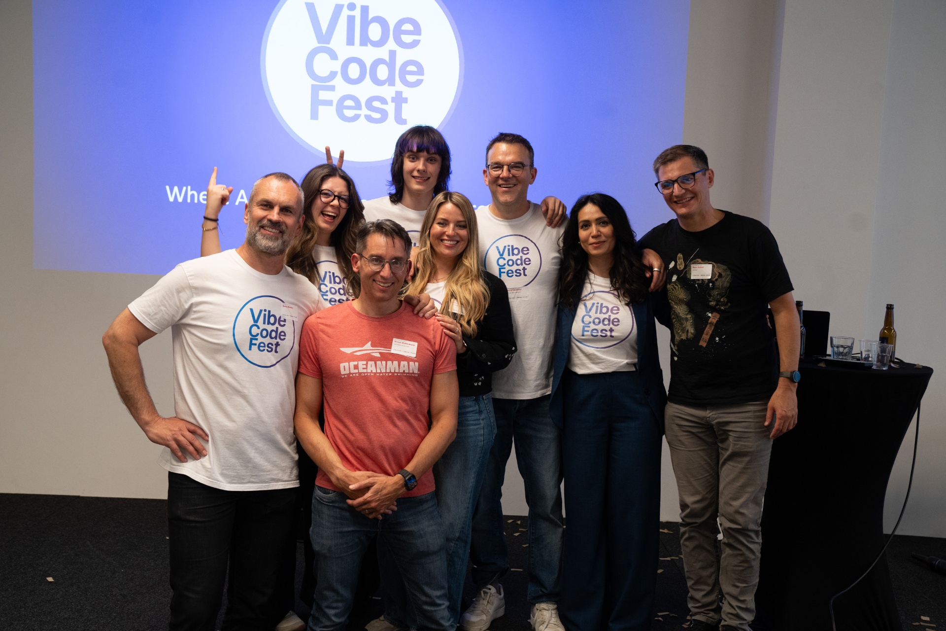
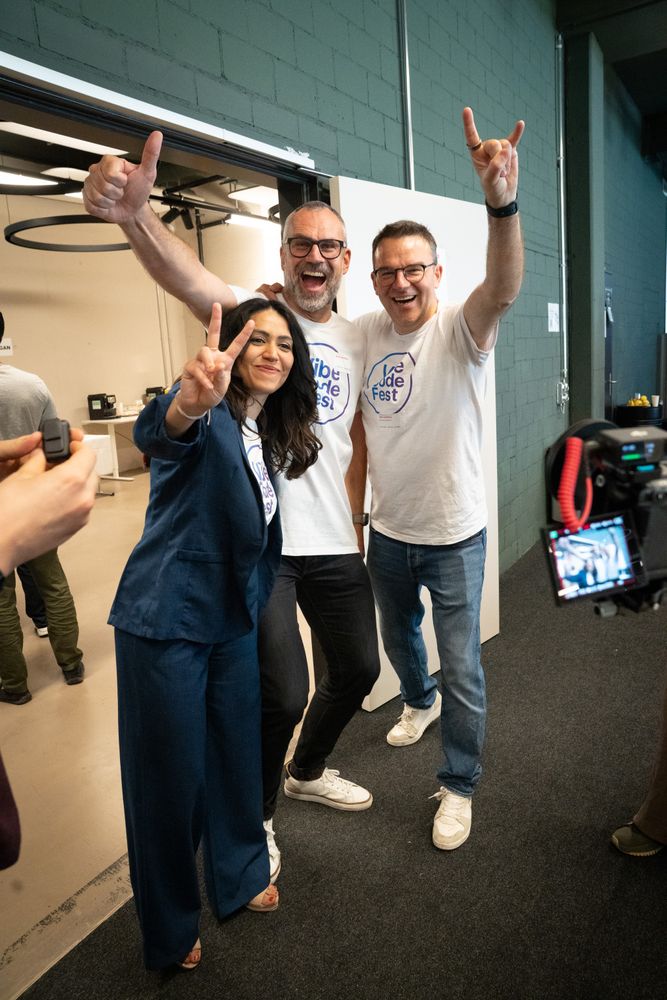
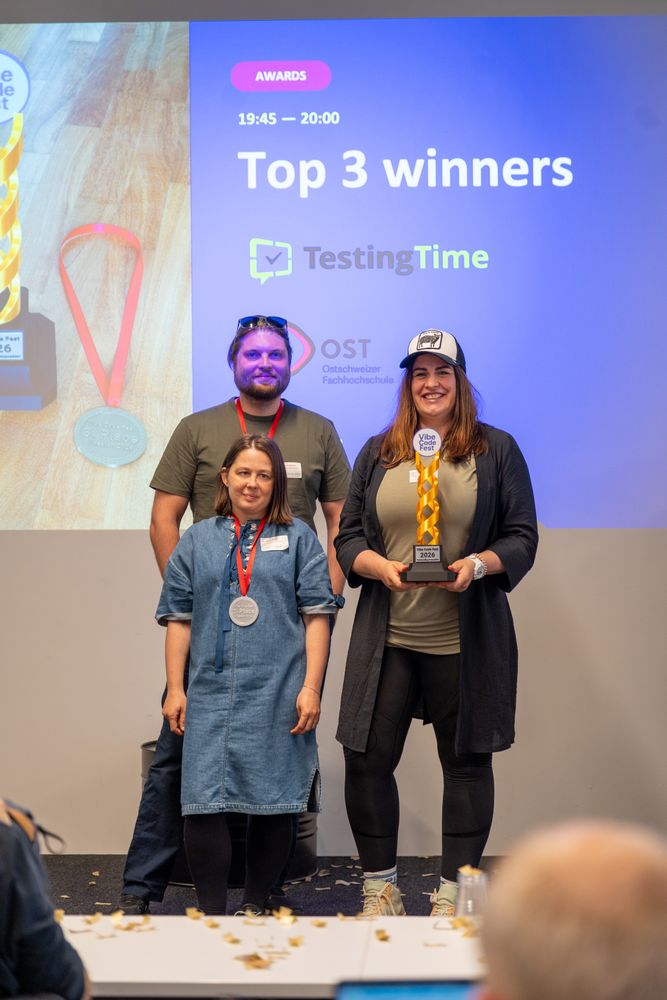
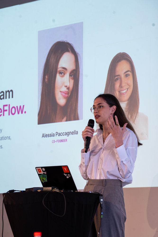
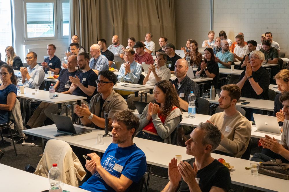
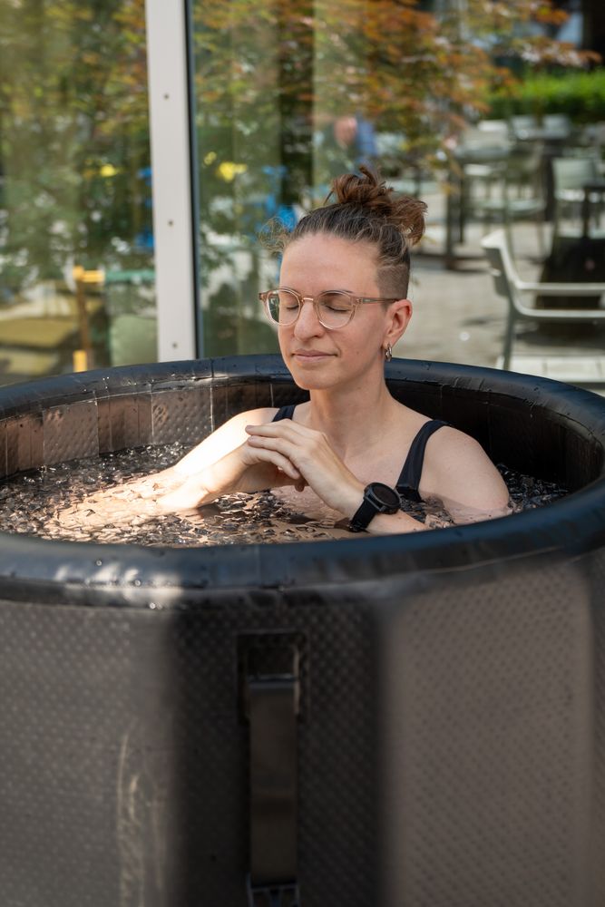
bg-gradient-primarybg-cardrounded-cardrounded-lgSix photographs share one gradient frame with rounded tiles, a gallery button and an optional credit line inside. The grid uses two columns on mobile and three columns from tablet size onward.
Code
<PhotoFrame
  photos={eventPhotos}
  href="https://example.com/full-gallery"
  credit="Photos by Silvan Mühlelemann"
  creditLabel="mühlelemann+popp AG"
  creditHref="https://example.com"
/>
Ticket card
The tear line and side notches are rendered with a CSS mask, so the ticket works on gradient or image backgrounds too. The top area shows the tier price; the bottom area shows the regular-pass comparison.
Code
<TicketCard
  pill={<Badge variant="brand" tone="solid">Early bird</Badge>}
>
  <TicketPrice>
    <span className="text-body font-semibold">89 CHF</span>
  </TicketPrice>
  <TicketRegular label="regular price" price="129 CHF" />
</TicketCard>
Heading & Text
Speakers
Speakers
Speakers
Doors open at nine.
Doors open at nine.
Doors open at nine.
Doors open at nine.
Link
variant="inline"Full scheduleFull scheduleFull schedulevariant="nav"Full scheduleFull scheduleFull schedulevariant="quiet"Full scheduleFull scheduleFull scheduleAvatar

Speaker card
LinkedIn bubble
placement="inline" · placement="avatar"Code
<LinkedInBubble href="https://linkedin.com/in/nora-keller" name="Nora Keller" placement="inline" />
Sponsor card
variant="default"variant="highlight"variant="default" size="sm"variant="highlight" size="sm"Code
<SponsorCard logoSrc={atollLogo} name="ATOLL by EUTIMA" variant="highlight" size="sm" href="https://atoll-by-eutima.example.com" />Schedule timeline
SPARK
An inspiring opening to ignite creativity.

SHARE
Interactive sessions led by the community.

BUILD
Turn ideas into working products.

CELEBRATE
Recognise the winners and close the day together.
19:30
Top five app pitches
20:00–22:00
Awards and celebration
Code
<Schedule>
  <ScheduleCategory markerTone="info" headerTransition="accentInfo">
    <ScheduleHeader icon="share" title="SHARE" subtext="Community sessions." />
    <ScheduleItem
      time="11:00"
      title="Community talk"
      speaker="Luca Bianchi"
      linkedinHref="https://linkedin.com/in/luca-bianchi"
      description="A short talk about building together."
      avatar={{ src: "https://example.com/luca.jpg", name: "Luca Bianchi" }}
    />
    <ScheduleItem time="12:30" title="Lunch" />
  </ScheduleCategory>
</Schedule>
Stat
FAQ
Open, closed, hover and keyboard focus are all live — tab into the questions above.
Navbar & Footer